Most of us use images of people on websites and printed materials without really understanding how the subtle nuances of these images influences people.
We use clichés like “a picture is worth 1000 words” and phrases like:
- ‘image needs to blend in’
- ‘adding to the corporate image’
- ‘being consistent’
and so on..
But how is any of the above going to help us achieve a single objective on a web page or a brochure? ie influence the reader to take some action!
If you are a designer, entrepreneur or a direct response copywriter this will interest you.
Research has shown that we are wired to look at ‘a face’ before anything else. It makes sense as infants we start to make sense of the world around us by observing the faces of people close to us.
We look where they look….
If we look at someone’s face and if they happen to be looking at something else – say object A – we tend to turn towards object A as well.
Here is evidence….
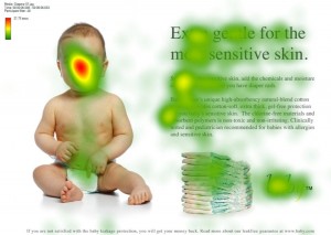
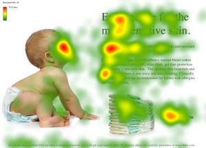
Research was done using an ‘eye tracking’ device to measure how people behave when they look at an image of a person. The eye tracking device produces a ‘heat map’ showing where people spend most of their time.
This baby is looking at you….
In turn you (or we) tend to look at the baby (as the heat map shows)
This baby is looking at the text…
Now a lot of people are actually reading the text that the baby is looking at and this is also increasing exposure to the brand!
Guess why this lady is looking at the red form?
So do use images to ….
- Show a product
- To make it easy on the reader to shorten the line length at the beginning. This will help the reader get started.
- Direct your visitor’s attention.
Don’t …..
- Use image for decoration
- Use stock images
- Use clip arts
+ Ravi Peal-Shankar


{ 0 comments… add one now }